Partial Payment
Now pay partially to book flight tickets
How did it all start?
Imagine you’re booking a flight ticket from Delhi to London but the total fare is going out of your current budget. What if we surprise you, “pay a fraction of total fare now and pay the rest later. Wouldn’t that be affordable and great?
Introducing Partial Payment in flight ticket booking
Taking one more step towards affordability.
We’re trying to solve a problem
To make flight ticket seem affordable to the users because they are expensive (and yes they are!)
The best part is no competitor of MMT is offering this level of affordability. So, yes we are the first one. And first is always the first.
Goals we wanted to achieve
1. Business goal: To make flight ticket seem affordable to the user by introducing Partial Payment feature. 2. Product goal: To increase conversion metric of users booking flight ticket. 3. Design goal: To increase the discoverability of partial payment feature.
I wasn’t alone, I collaborated with
1. two product managers to understand the scope of the feature and its objectives. 2. a senior UX designer (who was my mentor during my time at MMT) to get timely feedback and make sure I follow the MMT style of designing products and, 3. a few engineers to understand the tech constraints (if any) at every stage [thereafter, will be calling all these people as stakeholders]
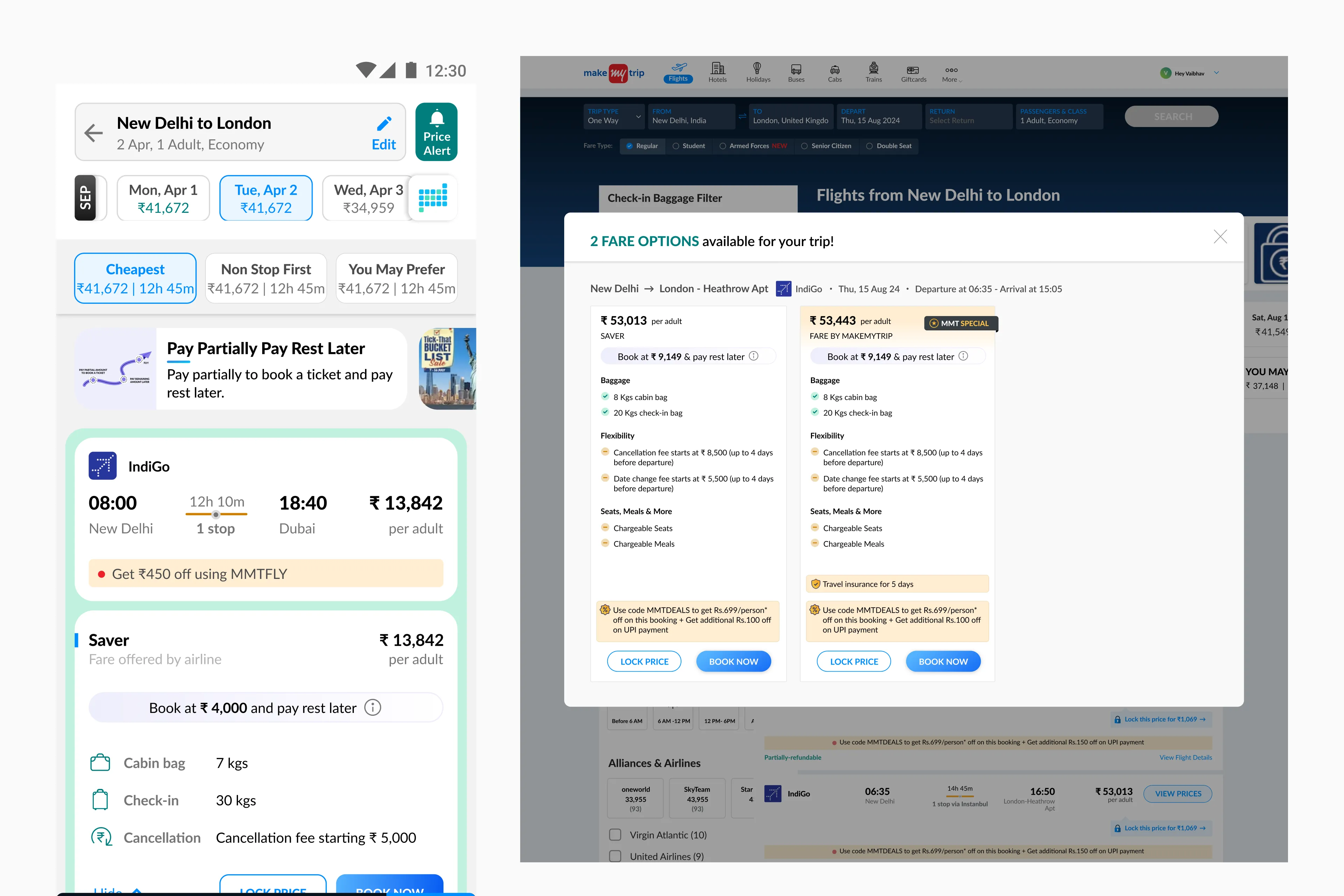
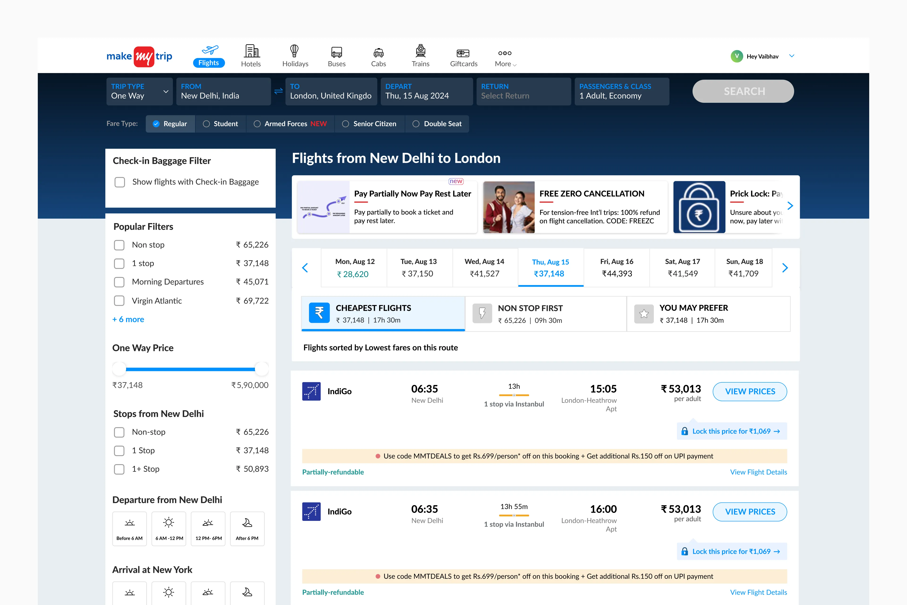
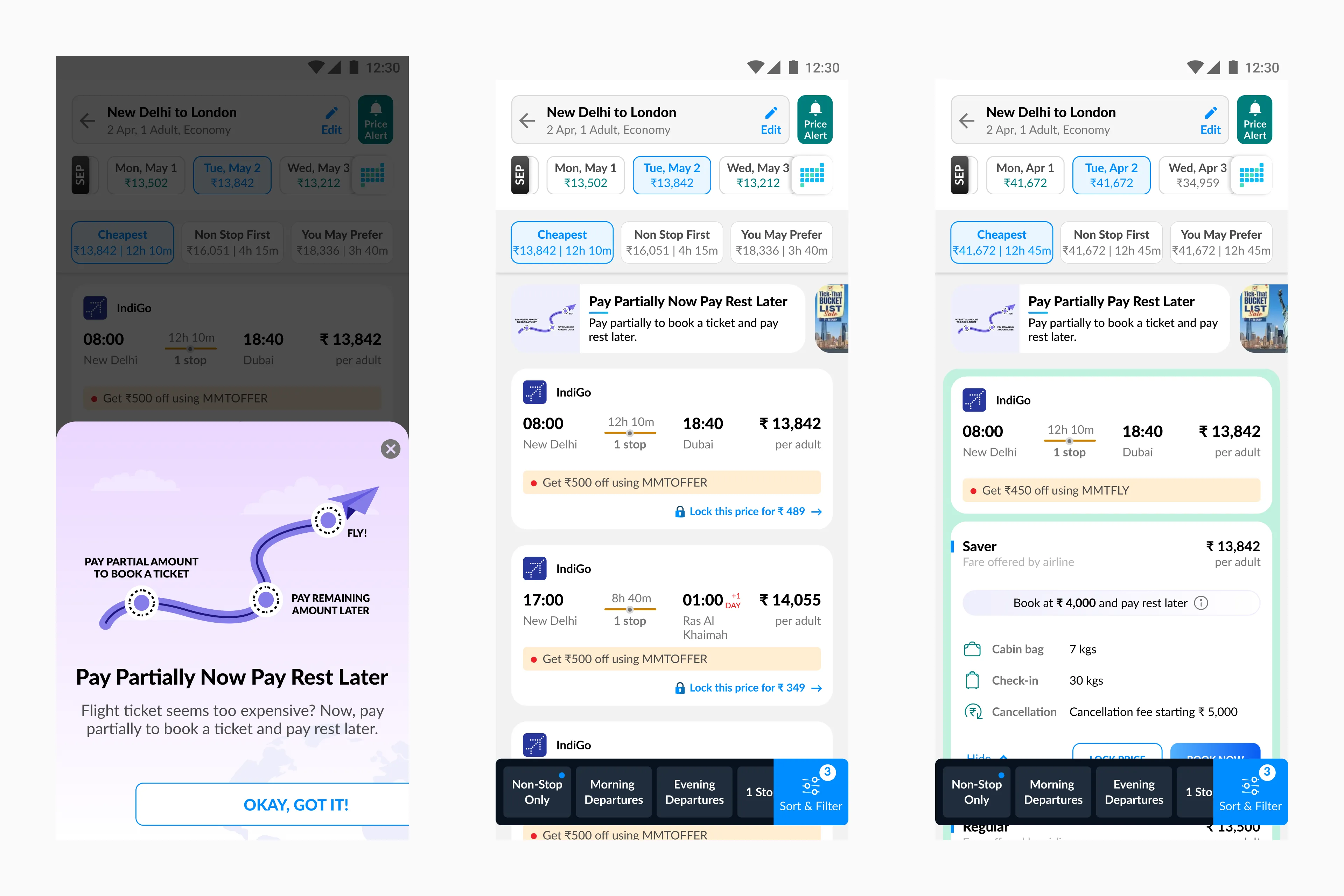
I started off by marketing the feature on flights listing page
after having a fair understanding of the feature we are trying to build. As the feature is completely new, we have to market it in such a way that users at least get to know about this feature. For that, we decided to show a modal soon after the user lands on the listing page. Here are some visual iterations I made for the modal.
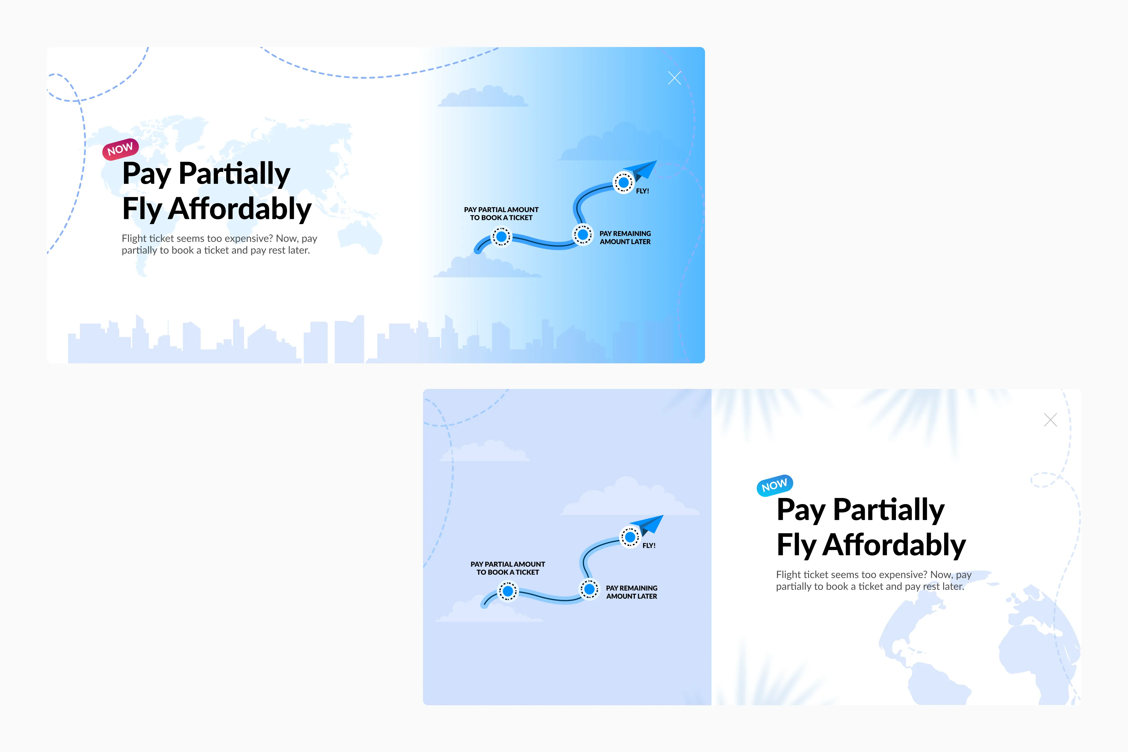
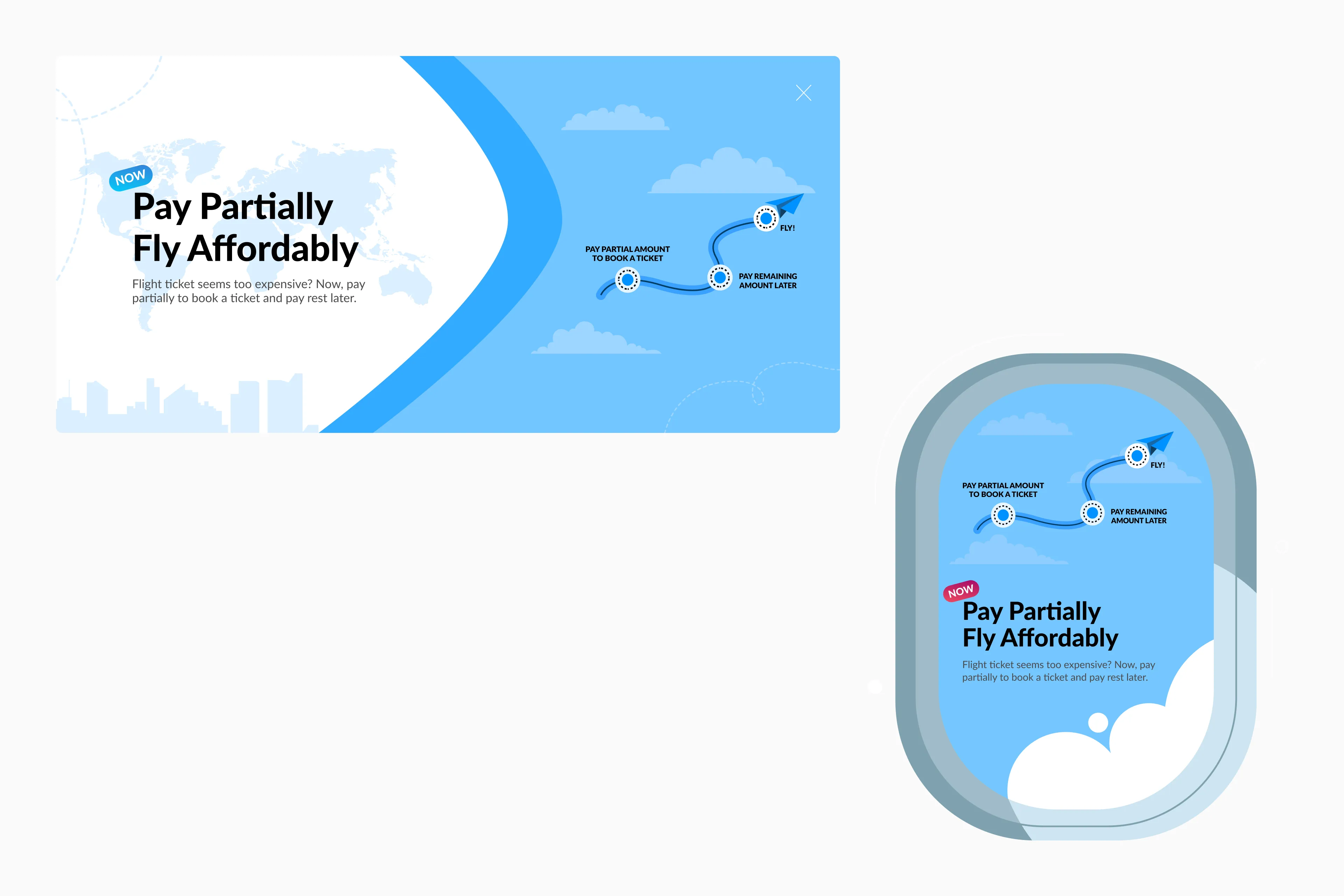
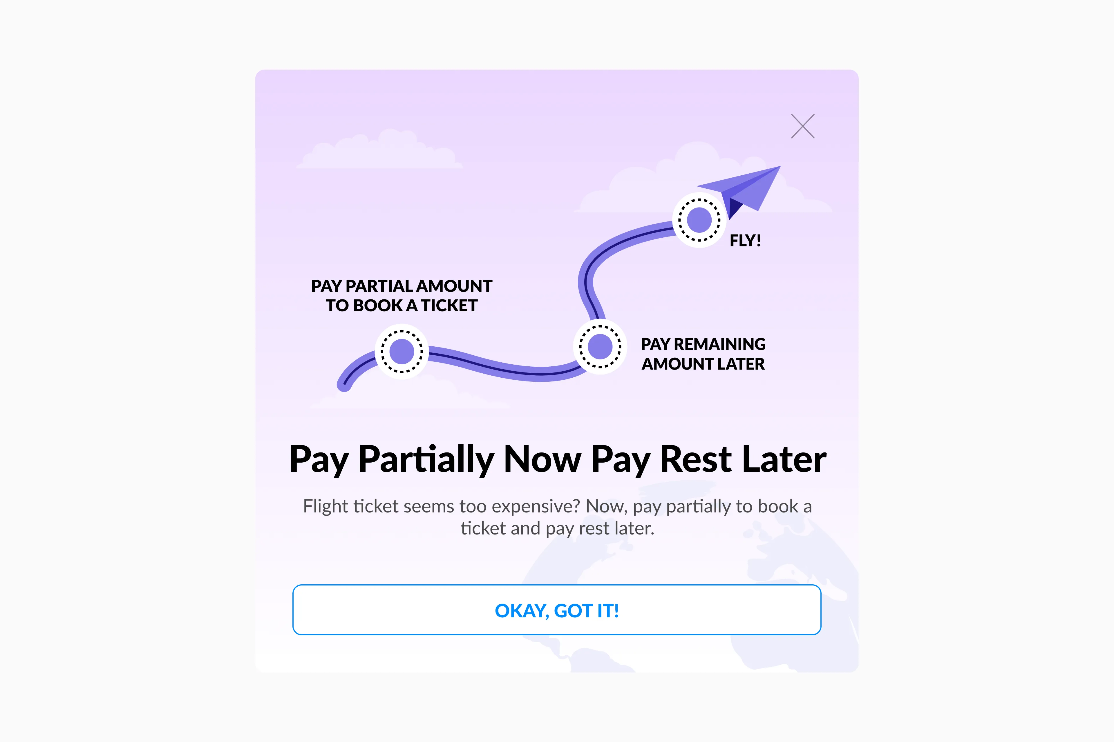
For feature discoverability, this is how the modal will appear just after the user lands on the listing page.
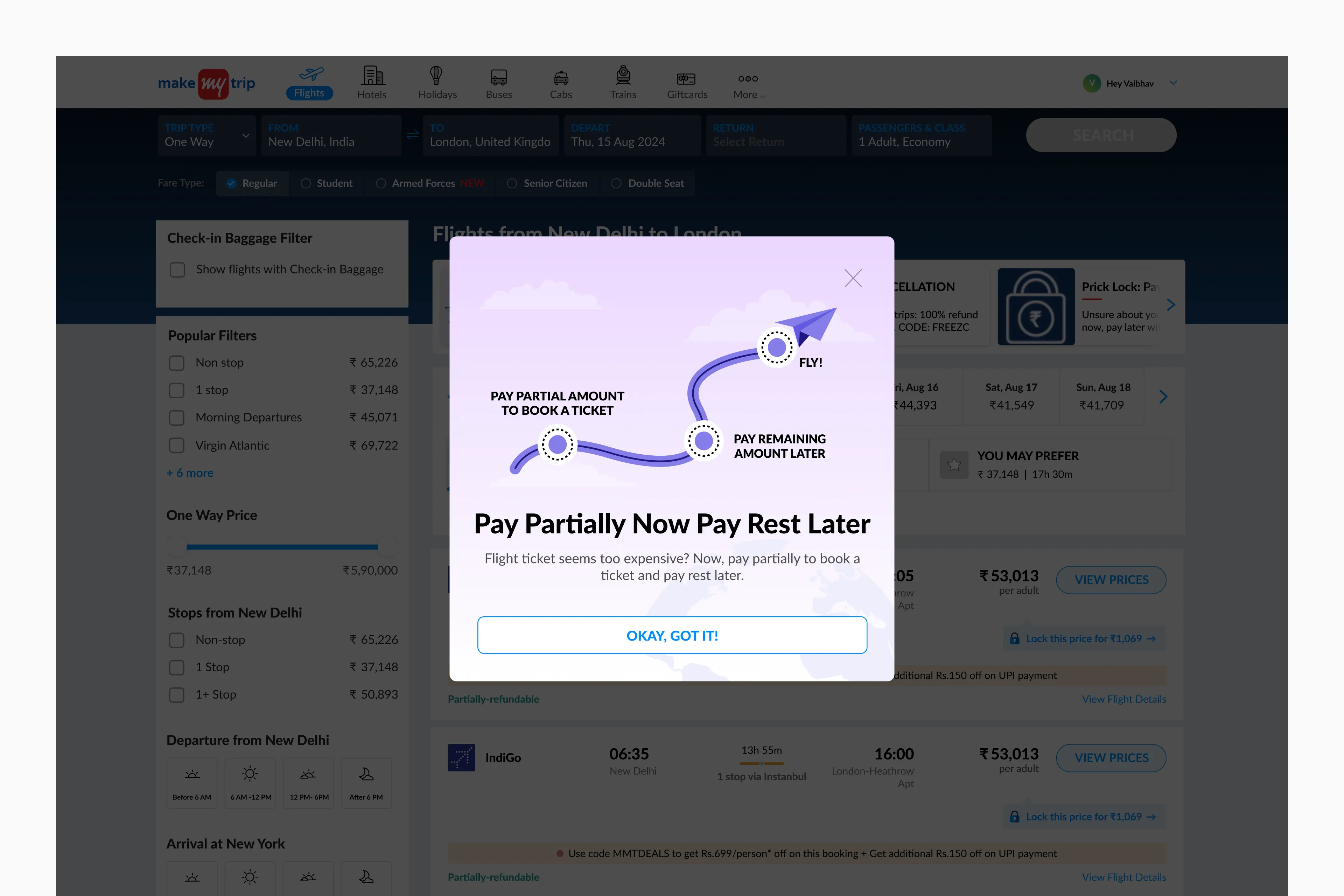
Apart from modal, to ensure users get to know about this feature I also added a banner in the carousel section of listing page where we showcase other new features as well.
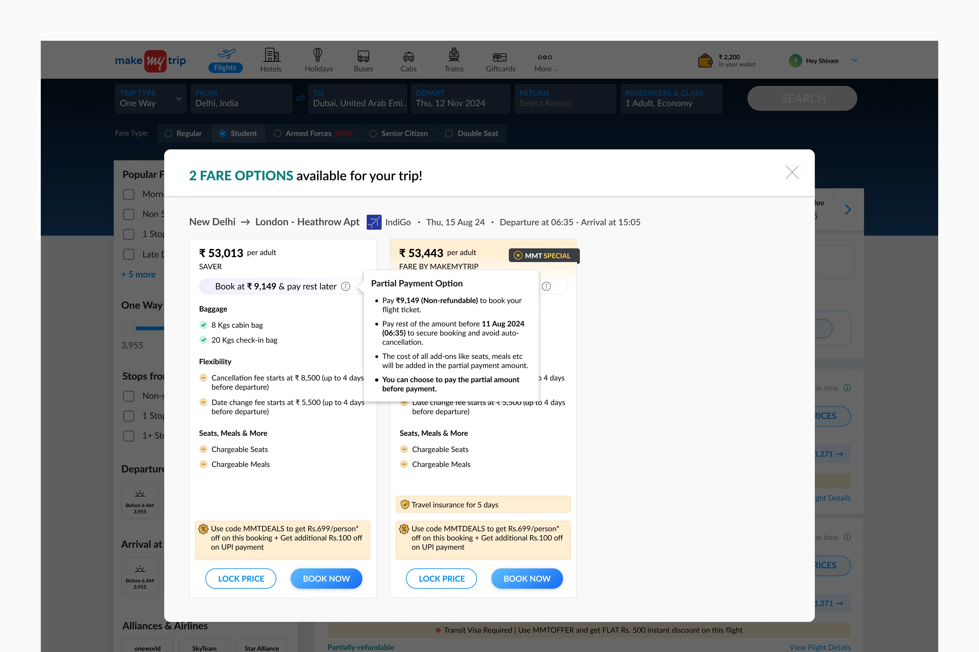
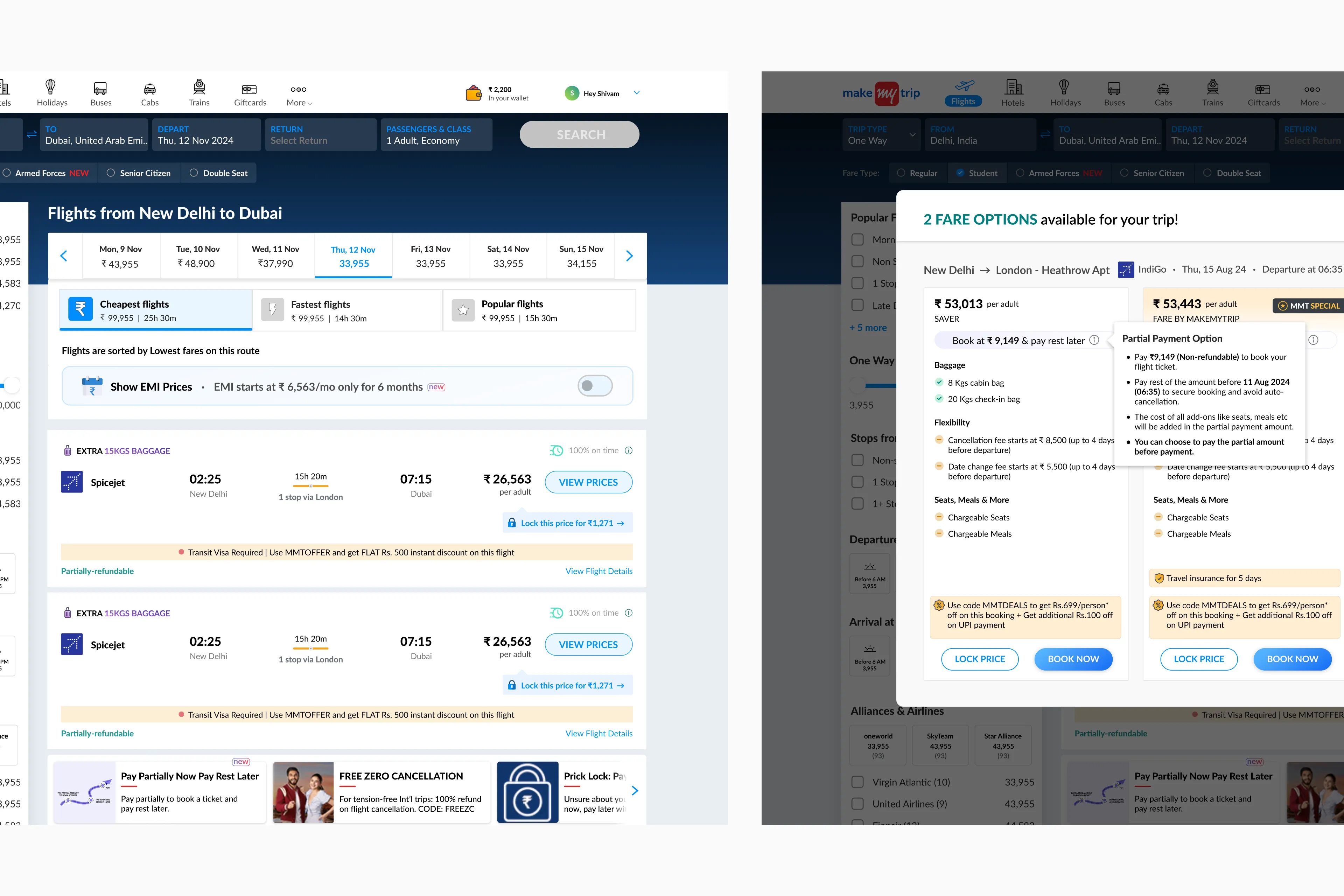
Jumping to fare family modal
This is the modal where the user selects the fare family of a particular flight viz., Economy, Premium Economy, etc. On this page, we will be showing the intervention of this feature for the first time.
Trade-off: We chose not to show this feature on the flights listing cards on the listing page to avoid clutter and user confusion on the already busy page, which also includes the EMI feature.
Here are some iterations I made for the fare family card.
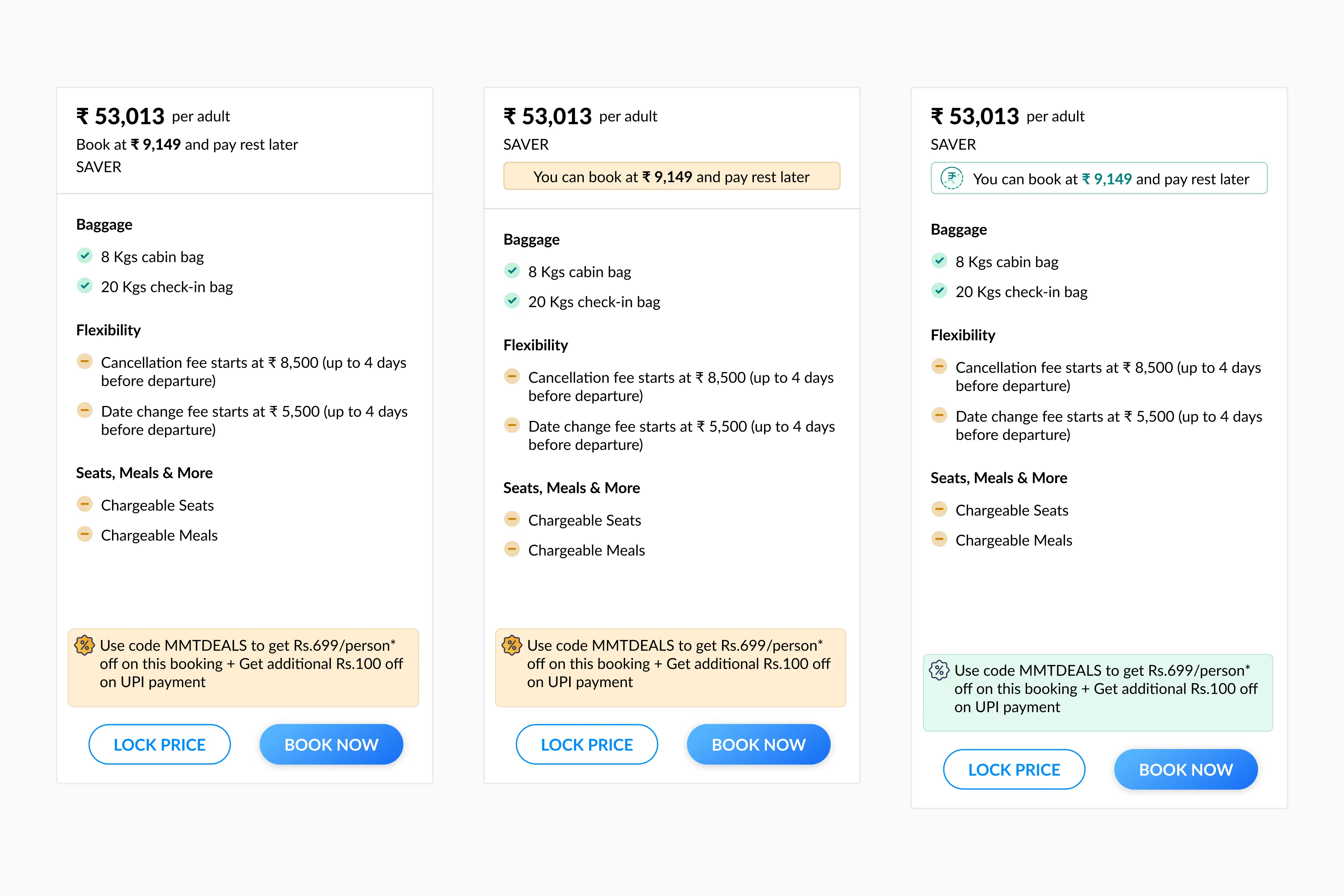
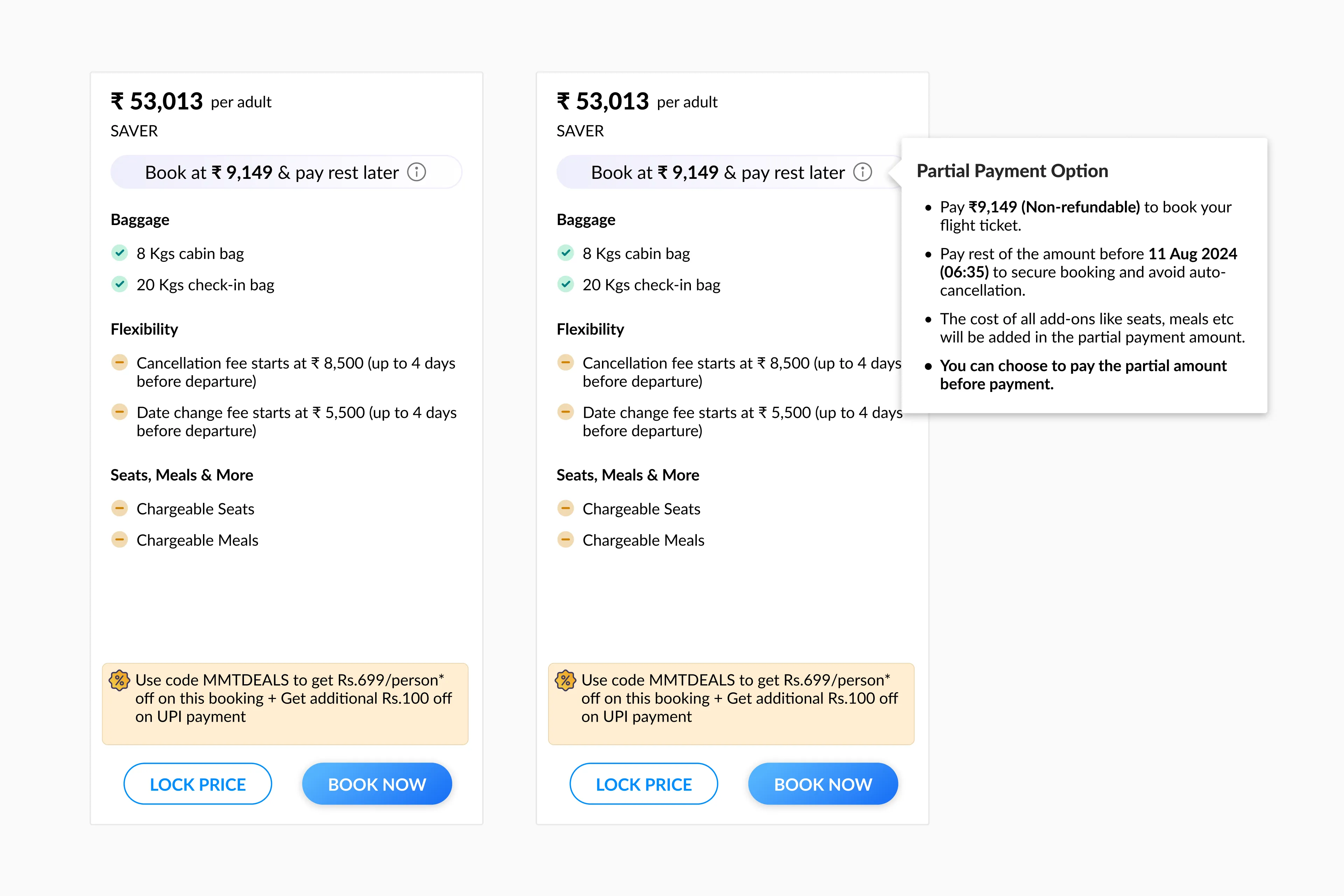
After extensive discussions with stakeholders, we decided that the final iteration should include not just the partial payment amount but also additional information such as: 1. Calling out that partial amount is non-refundable. 2. Deadline to pay remaining amount. 3. To call out that seats, meals, etc., add-ons will be included in the partial amount. 4. When the user can choose between partial payment and full payment. Here’s how fare family card will look like in action.
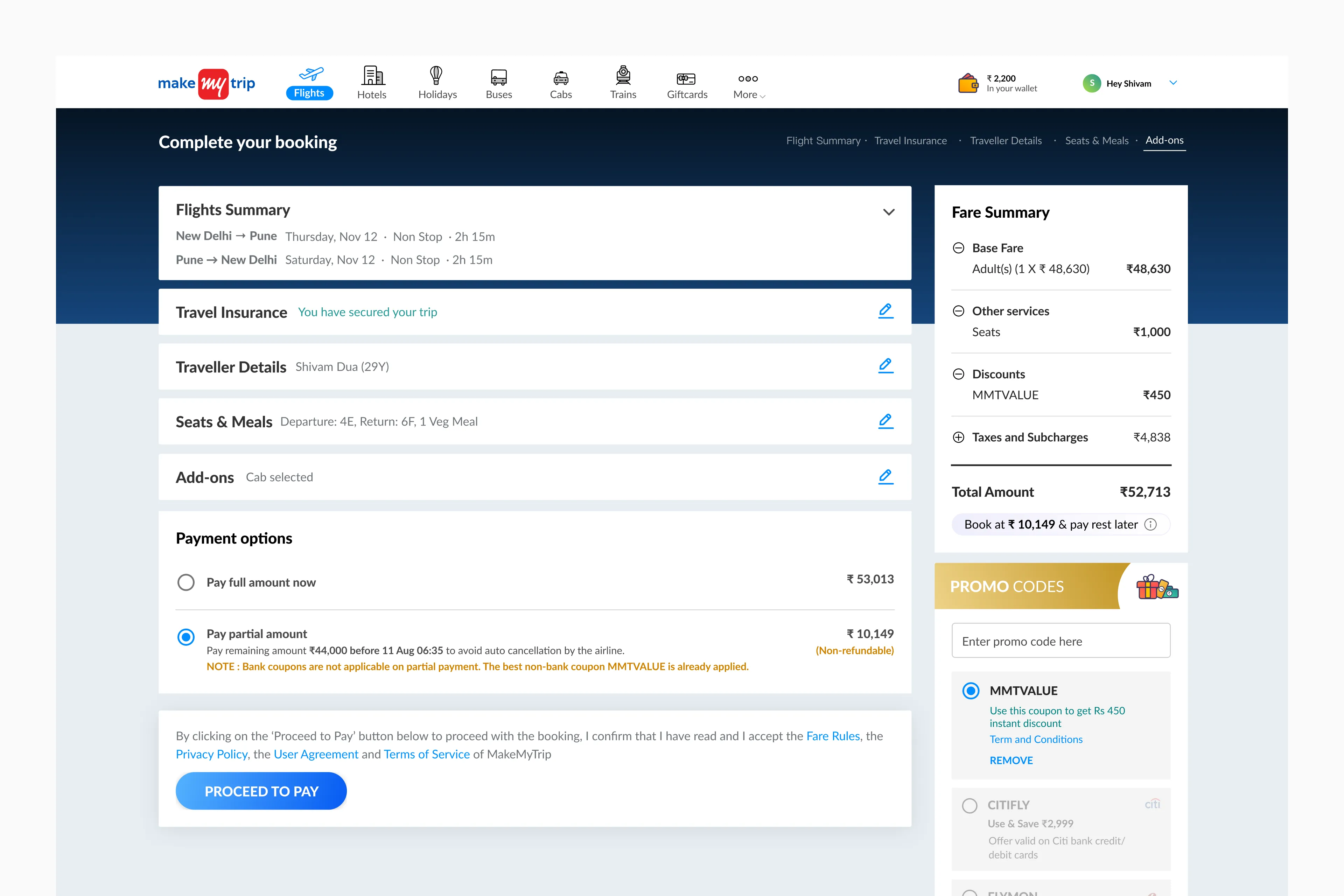
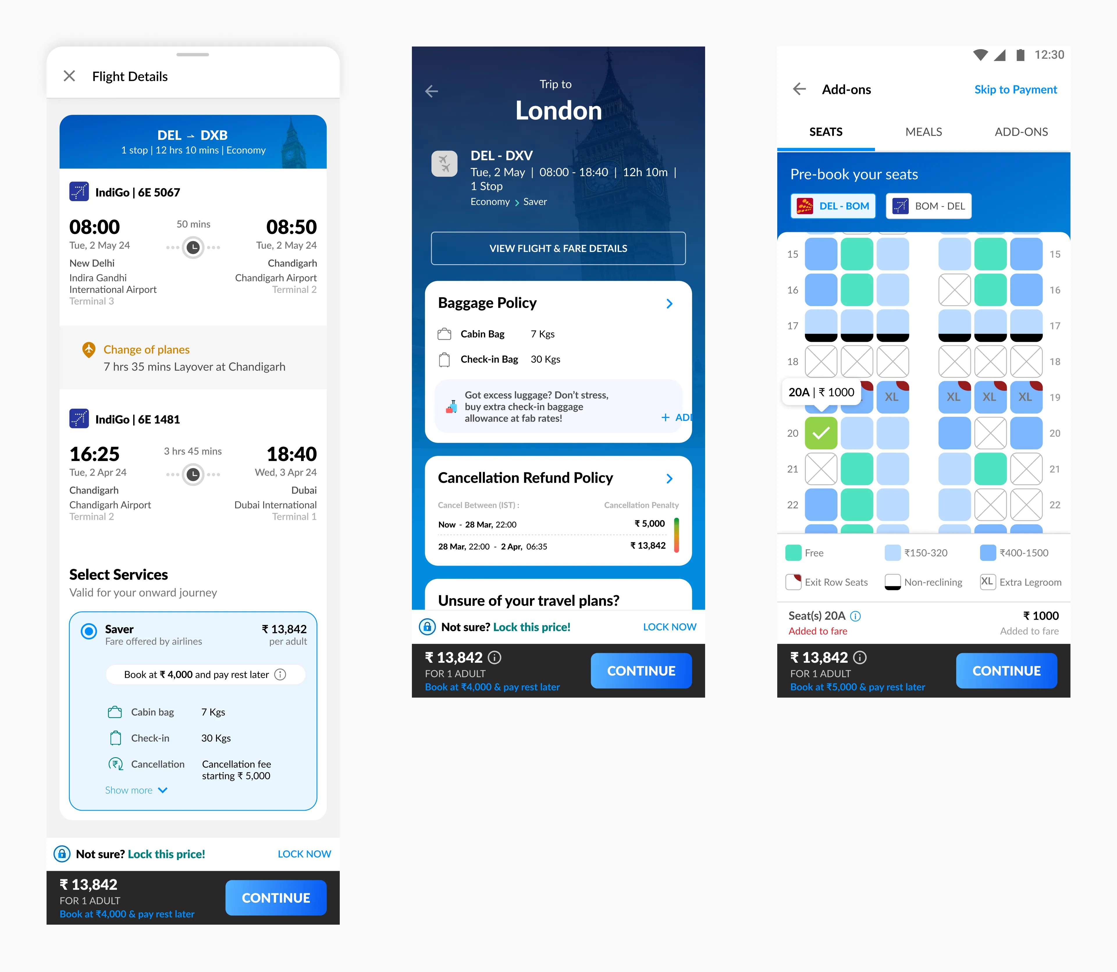
Now, finally it’s time for the Review Page
The only section that will change here is the fare summary section because it’s the only section which focuses on what amount the user has to pay which will change depending what the user adds like seats, meals, extra baggage, etc.
Here are some iterations I made for the intervention of partial payment in the fare summary section.
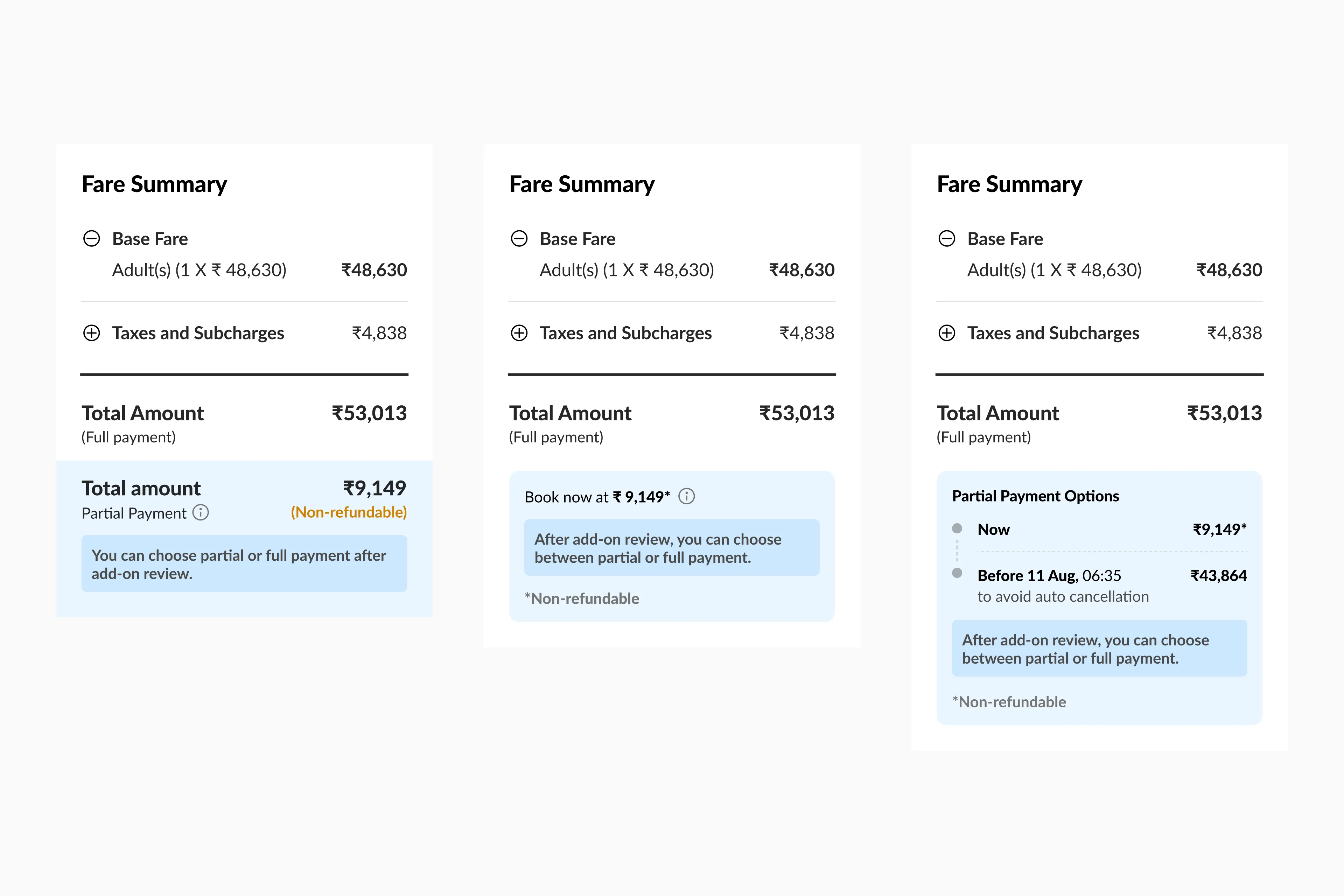
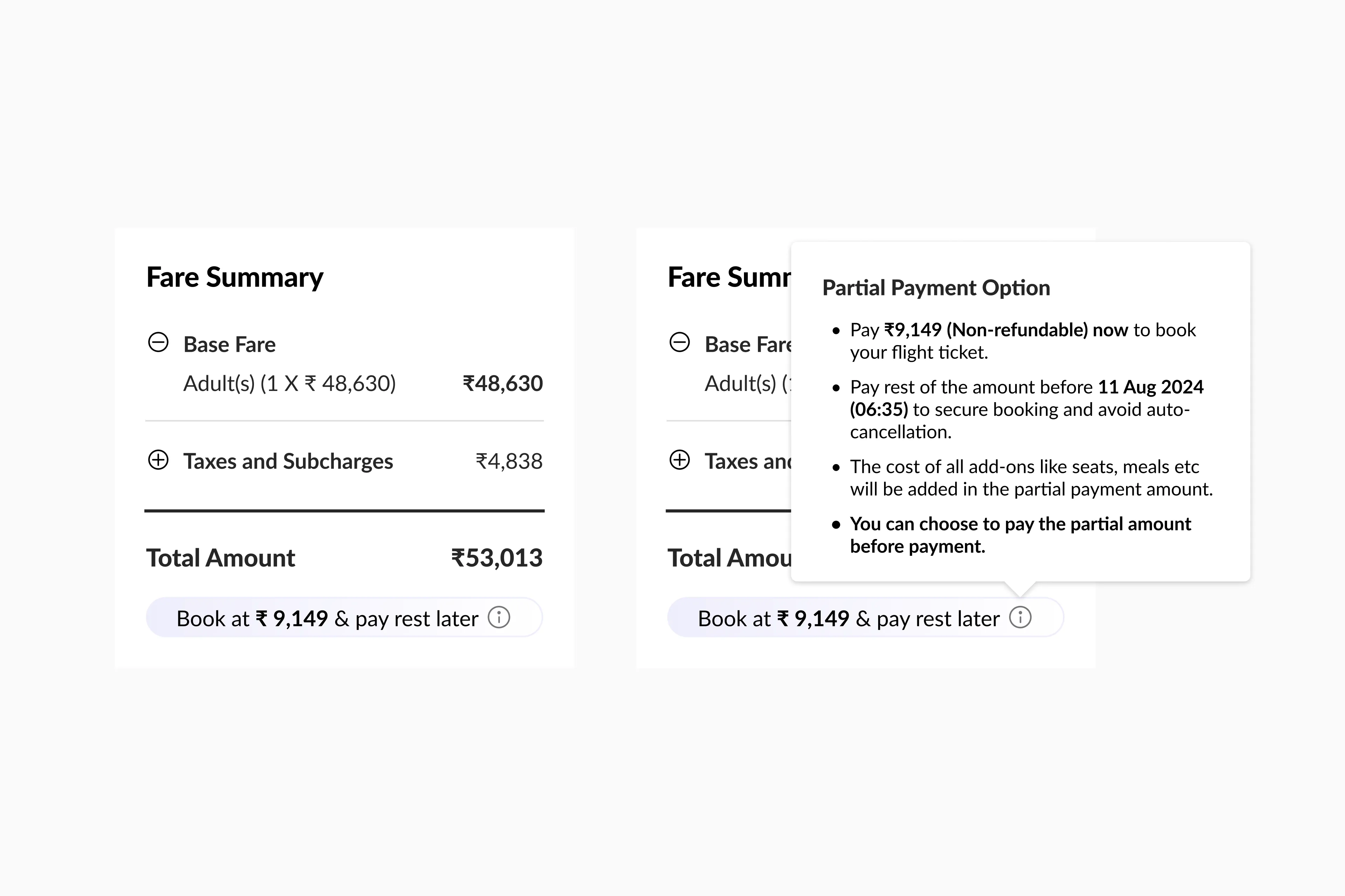
For the final iteration, we decided to use the same design language as used in the fare family modal. The fare summary is crucial on the review page, already containing many data points. We aim to avoid adding clutter and confusion for the user. Here’s how fare summary will look on the review page.
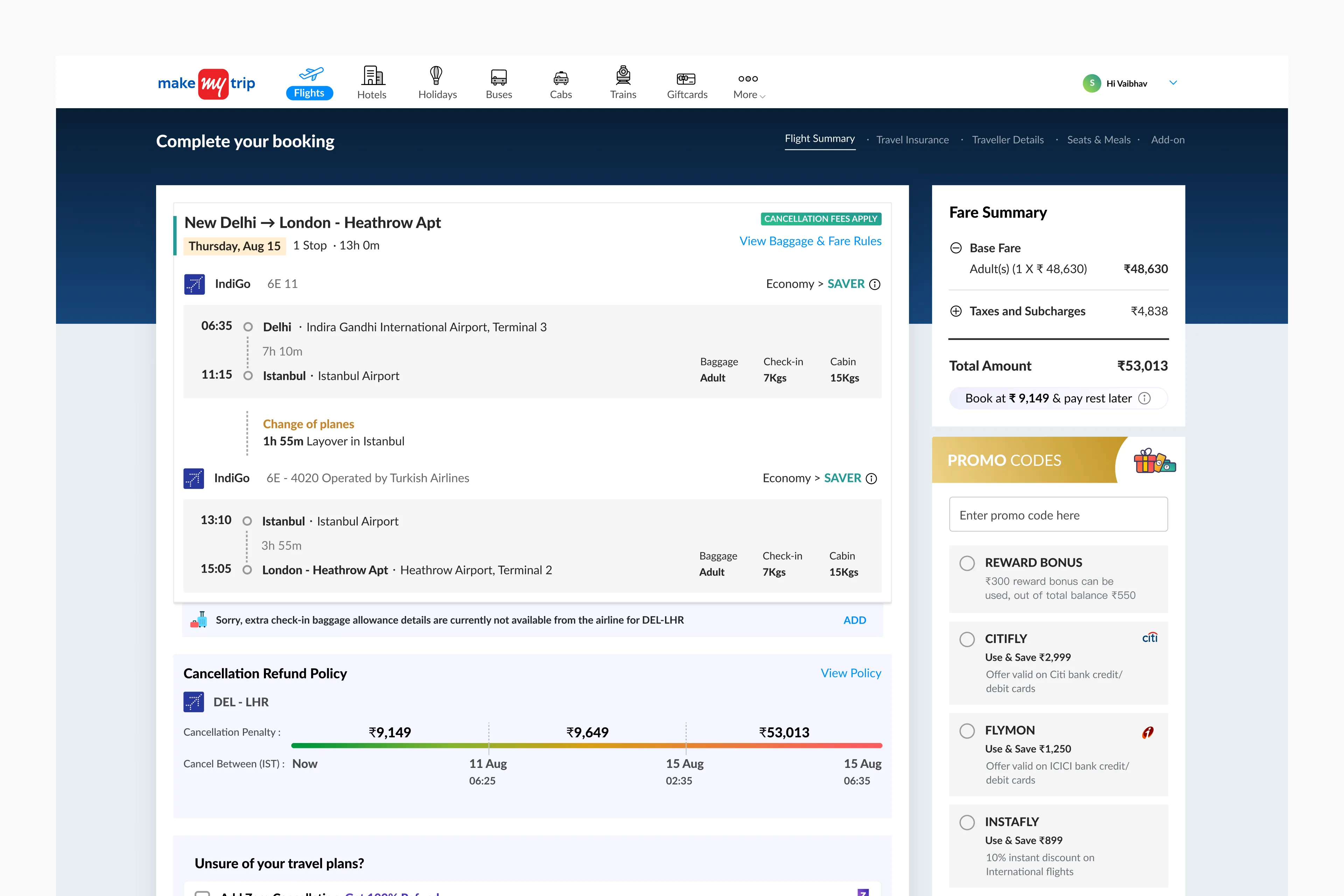
With this feature, one more step got added in the flow as we have to ask the user to choose between full payment and partial payment.
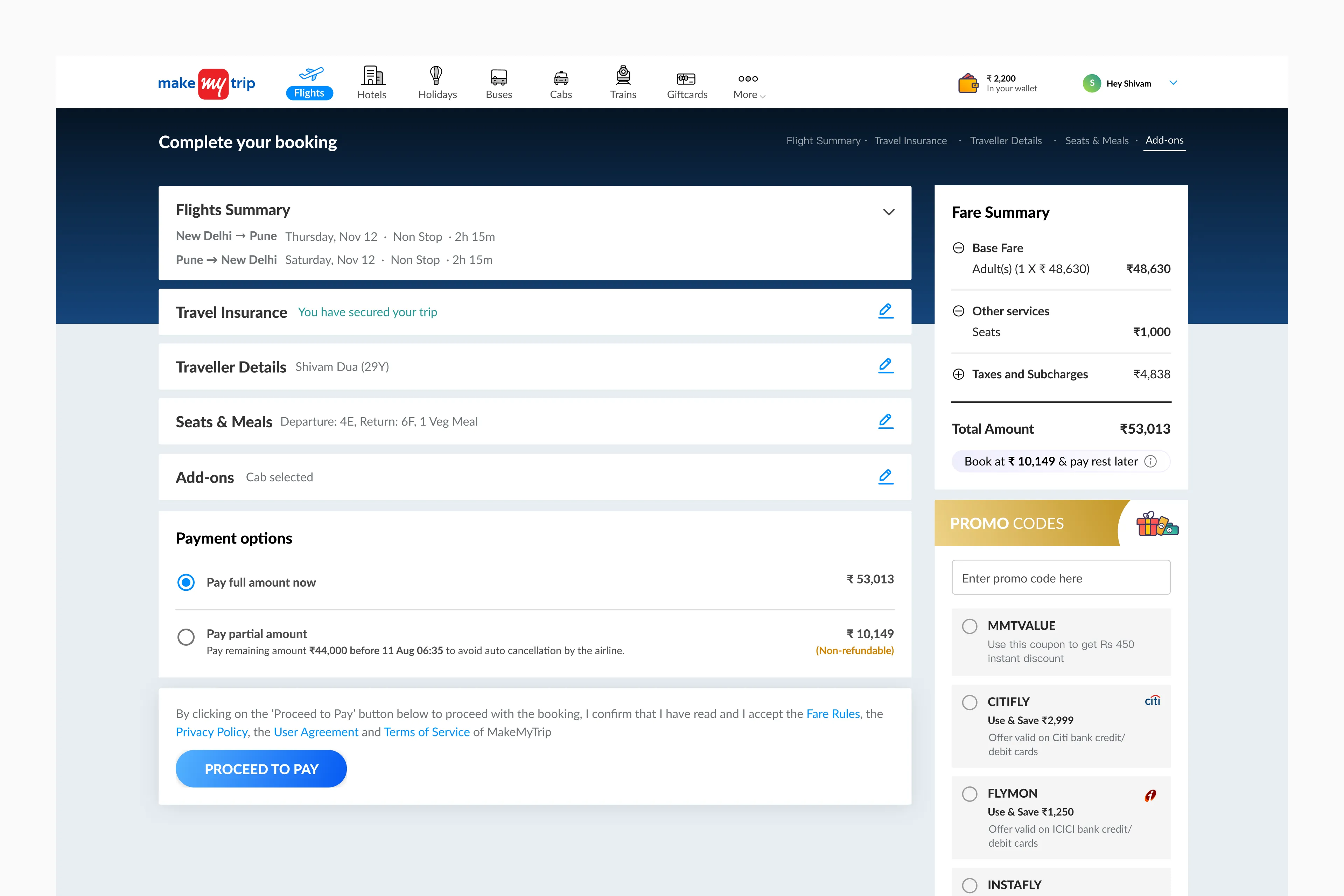
One caveat to this feature is, if the user opts for partial payment, they can’t avail bank offers. In case this happens, we will automatically apply the best non-bank coupon.
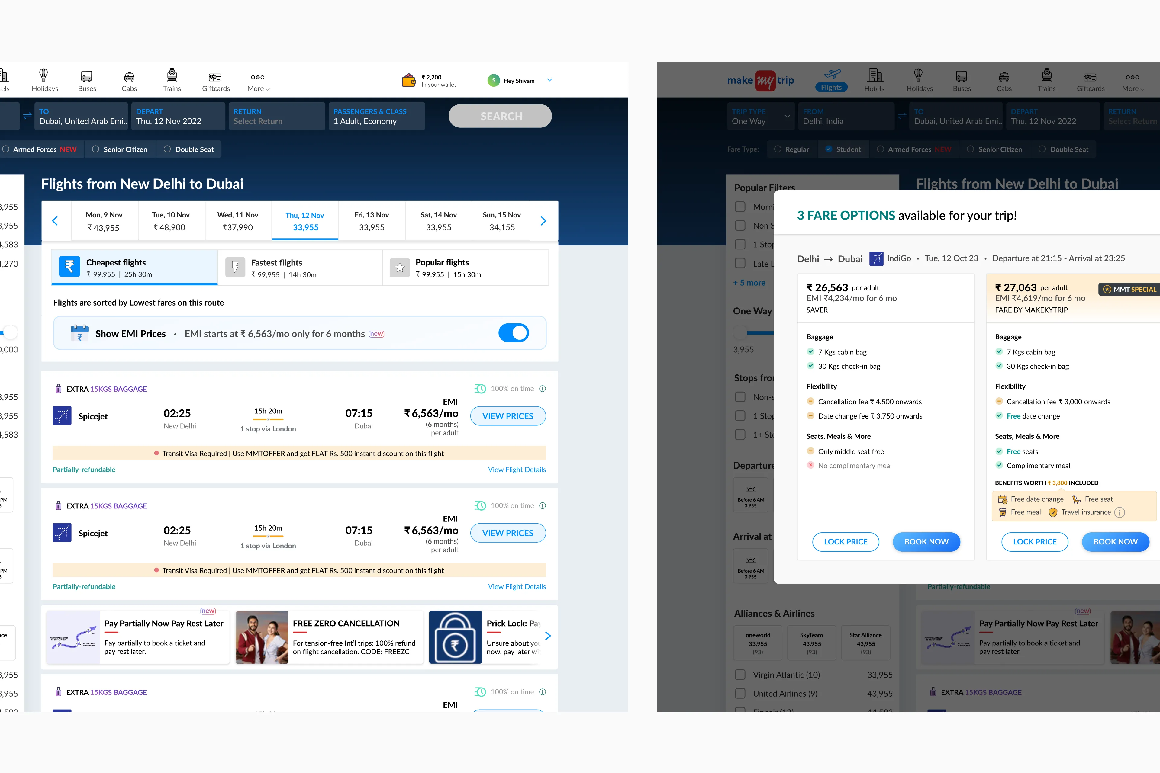
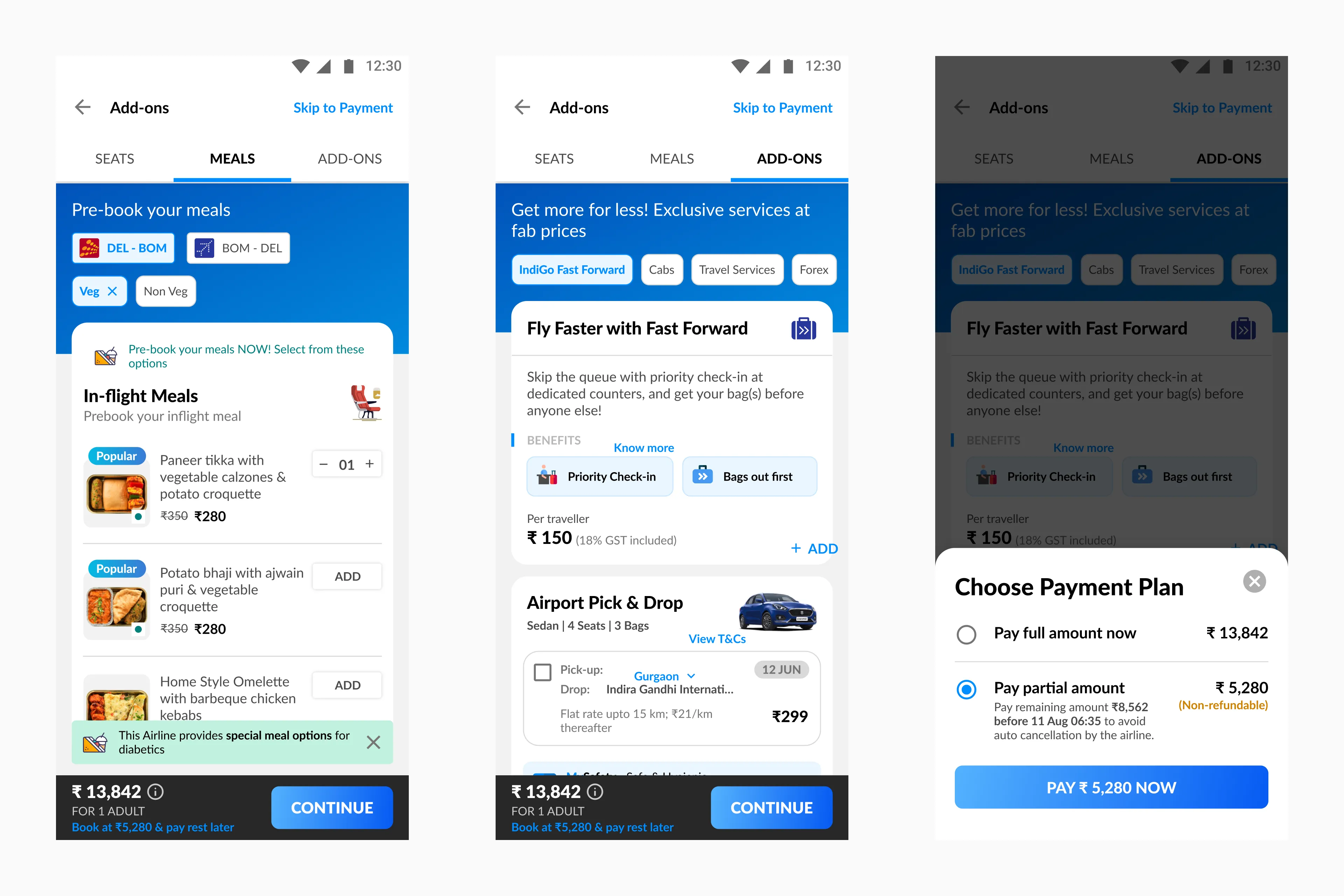
Trade-off: If users choose to view EMI prices right from the listing page onwards, they won’t have access to the partial payment feature. Managing both was too complex due to opposing edge cases, so stakeholders chose to focus on one affordability option for simplicity for both desktop and mobile.
This is how we handled both EMI and Partial Payment together.
With all being said desktop designs are sorted, now scaling down the designs to fit mobile screen size
Although I started with desktop designs first as there was no priority on platform to start with. Now, scaling down the designs to match mobile screen size was a cake walk for me as the flow was almost the same for both the platforms.
There is a post-sales flow as well
When the user had made a booking, cancellation, date and name changes, etc., comes under that. It was even more complex than the pre-sales flow discussed here.
That’s a wrap up. But before that a few things I learnt in this project
1. A healthy argument (especially with PMs) is sometimes necessary to make sure all the stakeholders are on the same page. Given that there are more than 10 stakeholders in this project, this is the most important learning for me. 2. Don’t design and change the intent of the other related elements on a page for the user given that a lot of users use the platform on a regular basis. 3. As a designer, I cannot solve for all the use cases in the phase 1. I had to made trade-off to not show EMI options along with partial payment as there were a lot of opposing edge cases to deal with in a very short span of time.
Thank you very very much for taking out time to read the case study
Feel free to reach out for any feedback, suggestions or if you want to discuss about this project in more detail or want to discuss about products and design in general.